In my design, I wanted to incorporate a bunch of different art styles and skill levels. This was to visually show that Queens College will help your creativity and skills no matter your artistic abilities. I had the image in my head of the images to be collaged in a smokey shape going upward. I went to five different friends, asking them for art pieces they would not mind me using. I credited them by having their signatures next to one of their pieces.
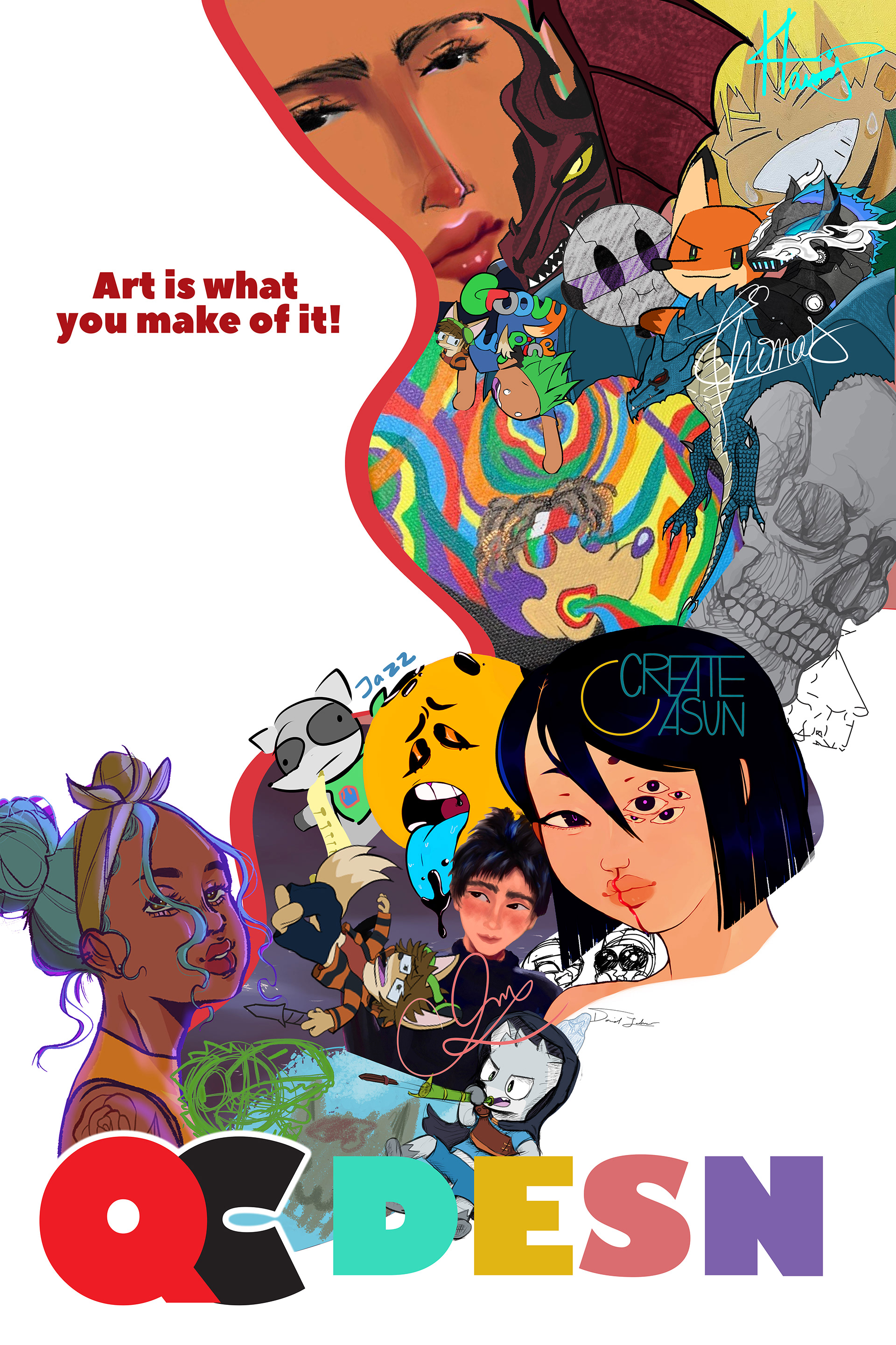
First Version
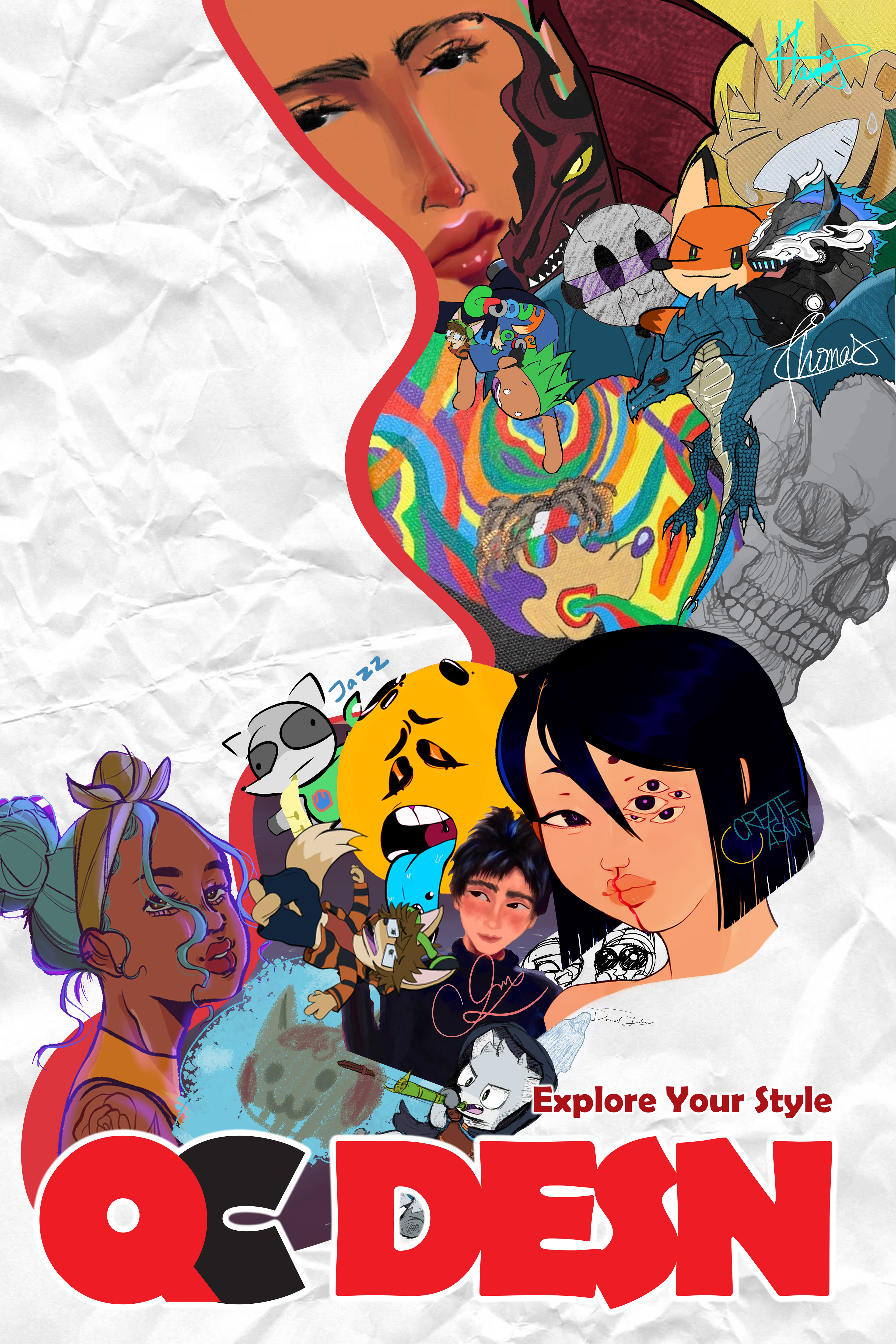
Second Version
The poster to the left is the first version. It has a different slogan, the background was only white, and the bottom text was more colorful. I went against this version after some criticism which helped it flow better and feel coherent.