Genre & Naming The Festival
I knew once the genre was chosen the look and theme would fall into place. My close friend- Groovy had given me the genre of alternative rock which I had no problem with. I know a lot of its bands and understand their look and feel.
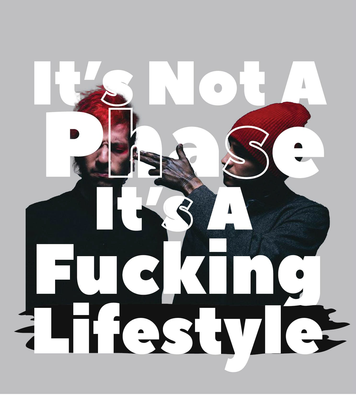
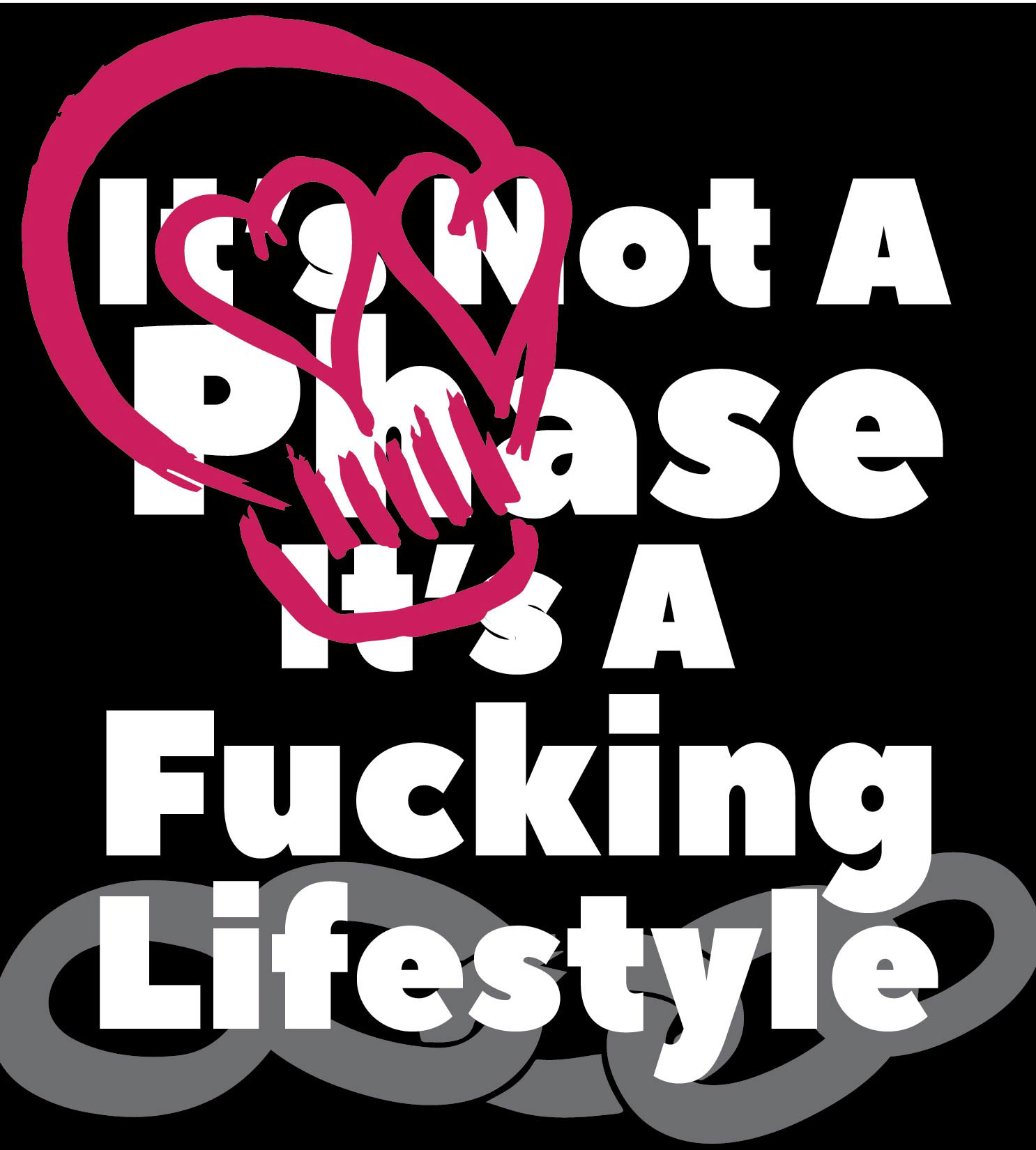
The fans of the genre 'alternative rock' usually have this connotation of being 'edgy' or usually listened to by angsty teens. I wanted the name to play around with this but in a playful way, that is catchy. I chose the name 'It's Not A Phase' because stereotypically that is what an angsty teen might say to their parents. My Groovy friend suggested adding to this with, 'It's A Fucking Lifestyle' to further the playfulness and also play towards 'alternative rock' bands usually having songs with long titles.
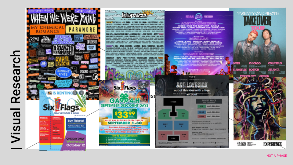
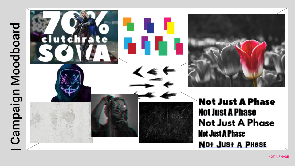
Research & Moodboarding
From there I got to work researching other flyers and posters that have been used for this genre of music. I also researched how other companies incentivize their services.
For my moodboard, I knew I wanted something punk-ish. Scratchy textures, neon highlights, and cool effects. I had a few ideas for fonts and even more for color choices. From there, inspiration started filling my brain and I got to my sketches and ADLOBS.
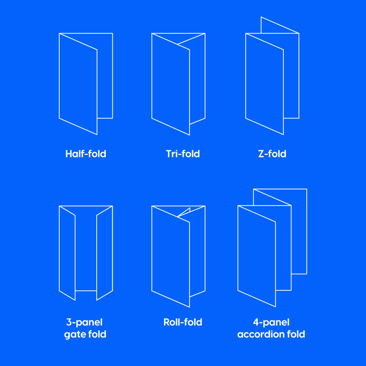
Folds
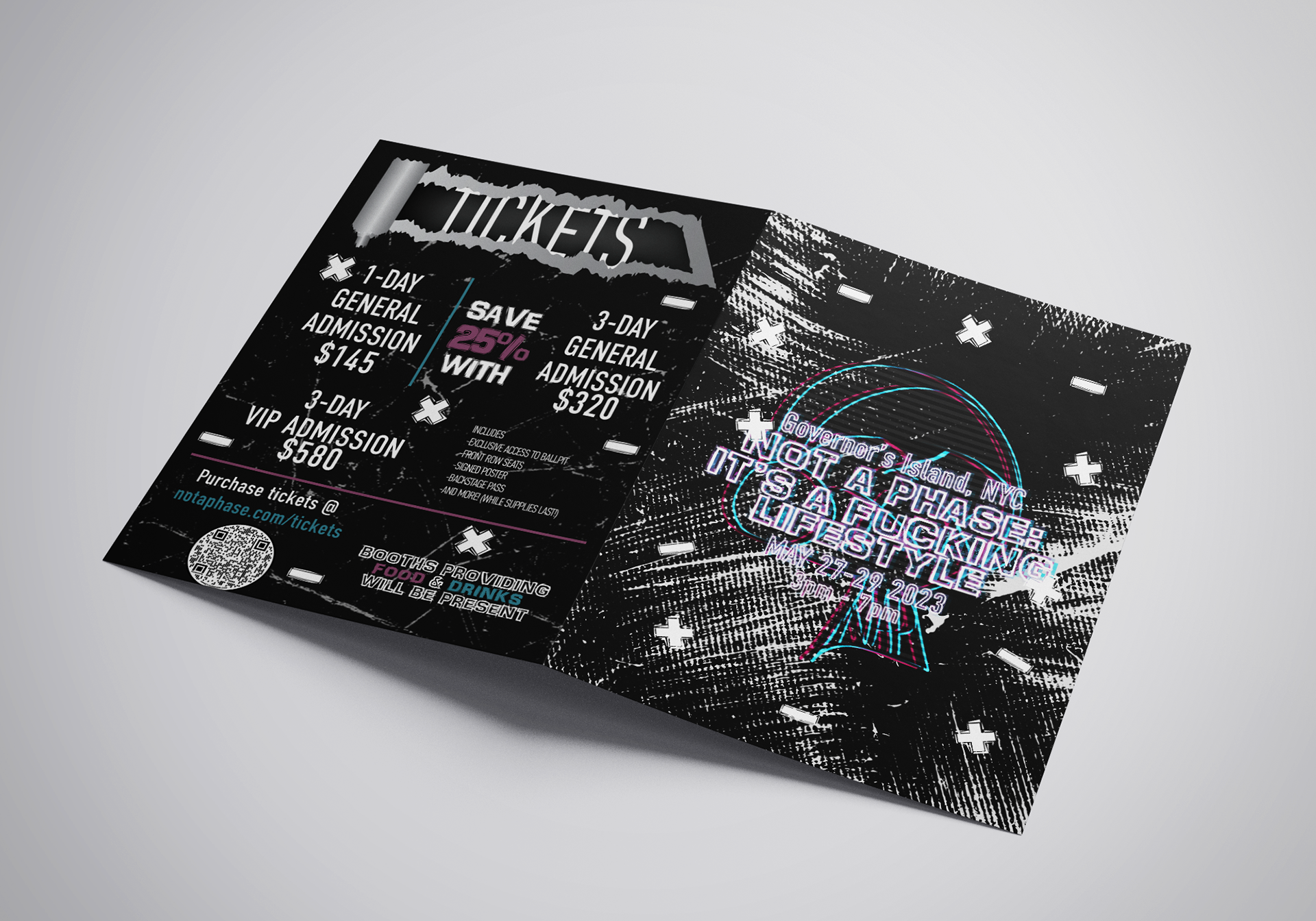
There were many types of folds I had the choice of doing for my brochure. Thinking of it from a user perspective I wanted it to be very simple and clean. That already crossed off the 4-panel accordion fold, Z-fold, and Roll-fold. I knew I didn't want a 3-panel gatefold due to how it presents information too quickly at once. This left me with the Half-fold and Tri-fold. I would choose the Half-fold for its slow and steady way of giving information at each flip or turn of the page and its simple but clean look.
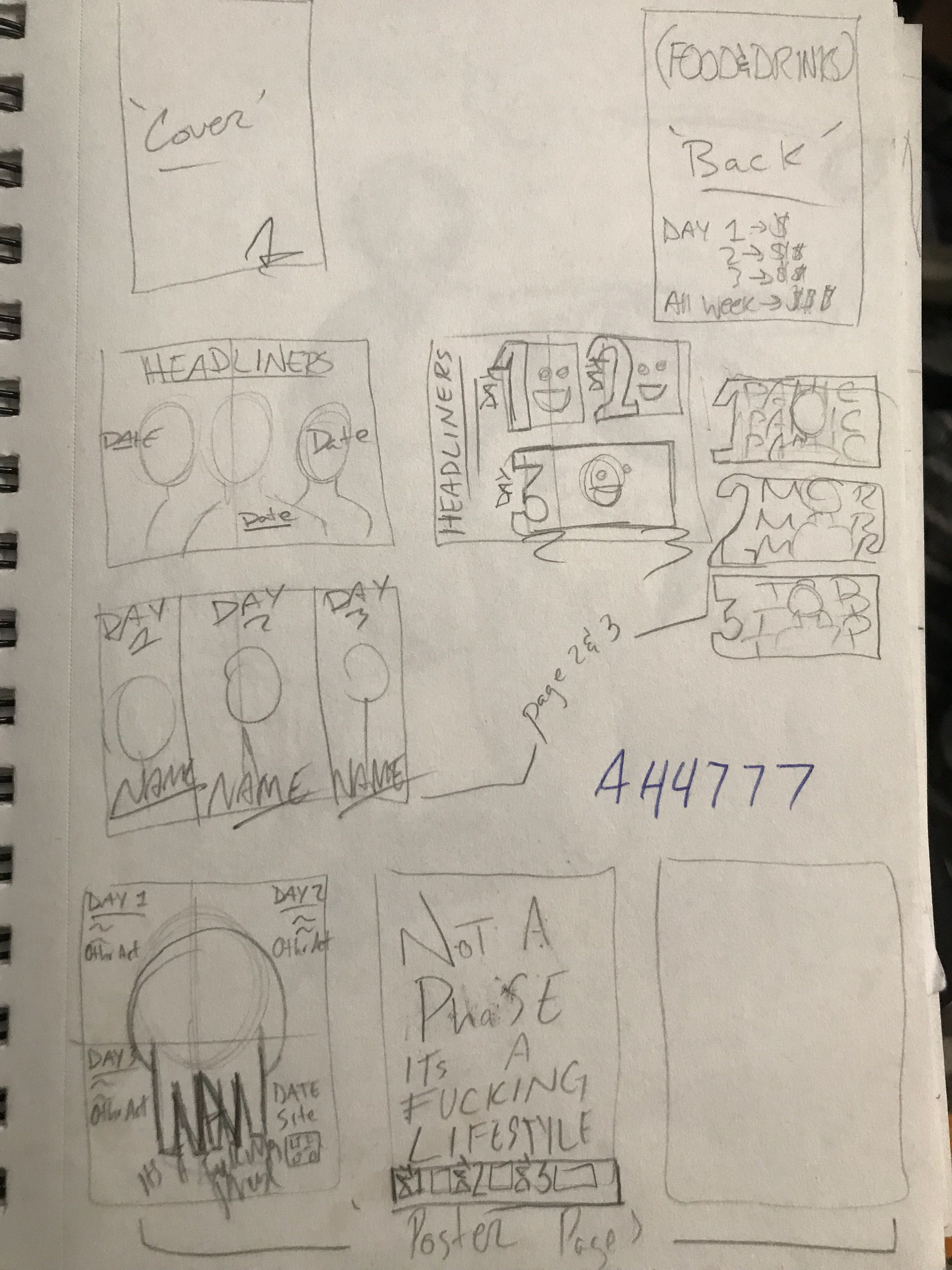
Planning & Logo
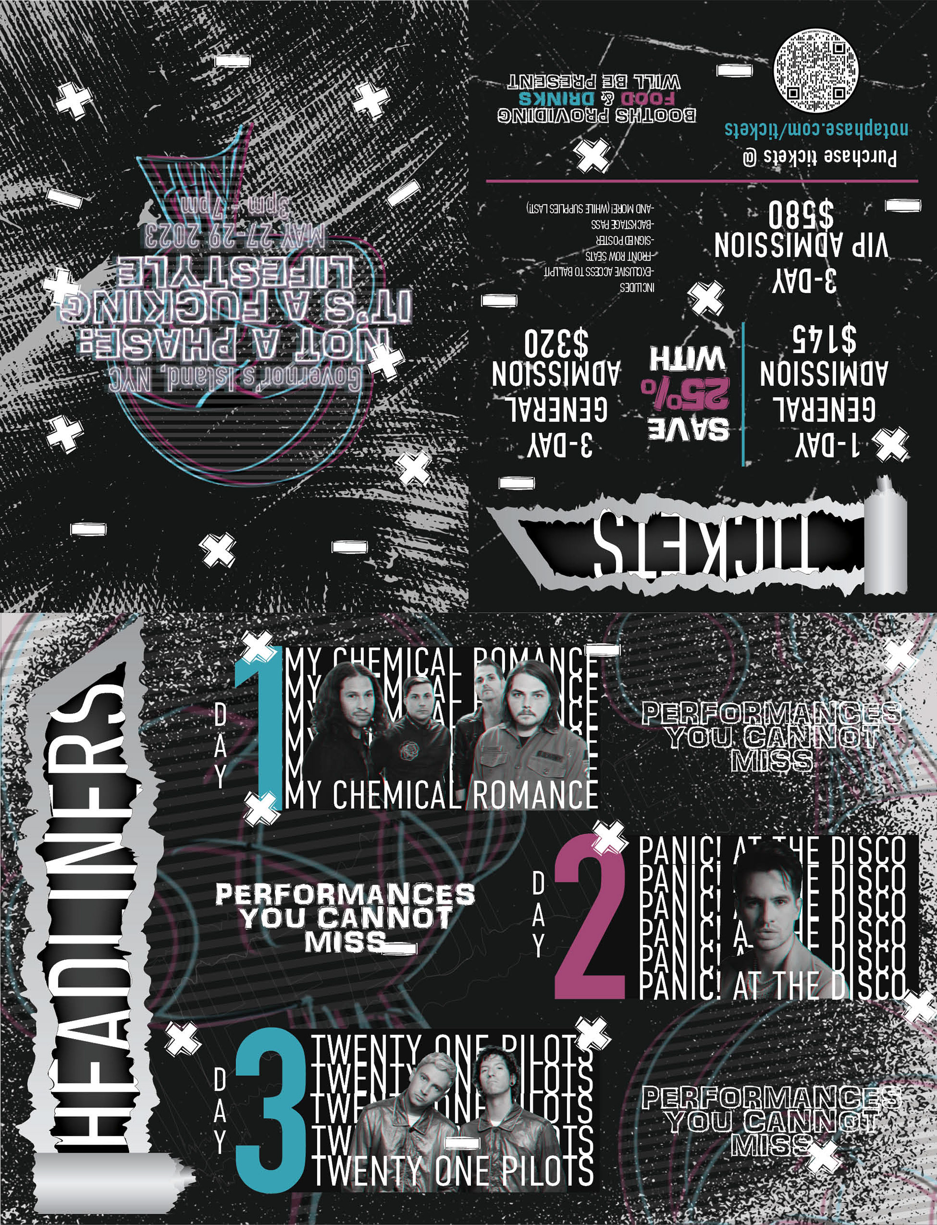
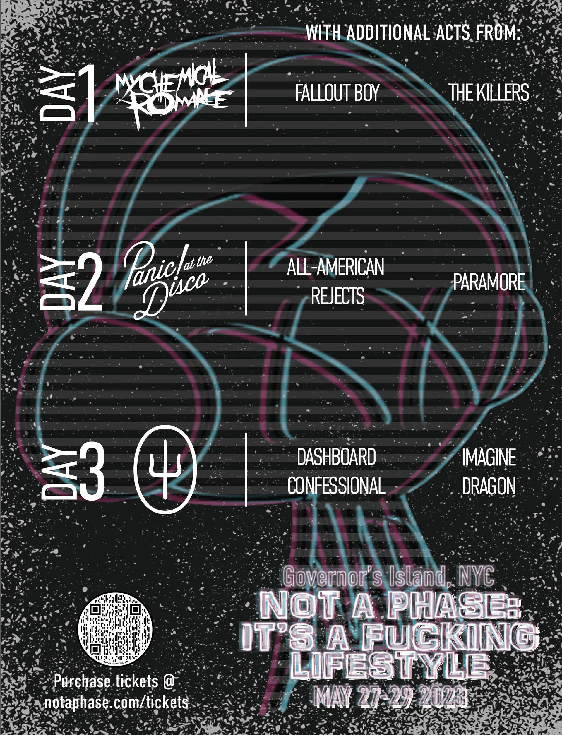
After that, I got to work on the sketches of what the pages might look like and what information each page will give. The cover would be the title, date, and location of the festival. The second and third pages would consist of the headliners on 'x' day. The fourth page or poster page would show every performer for each day, a call to action for purchasing the tickets, and again the name of the festival, date, and location. The last page or back of the brochure would be ticket prices, commodities, and another call to action to purchase tickets.
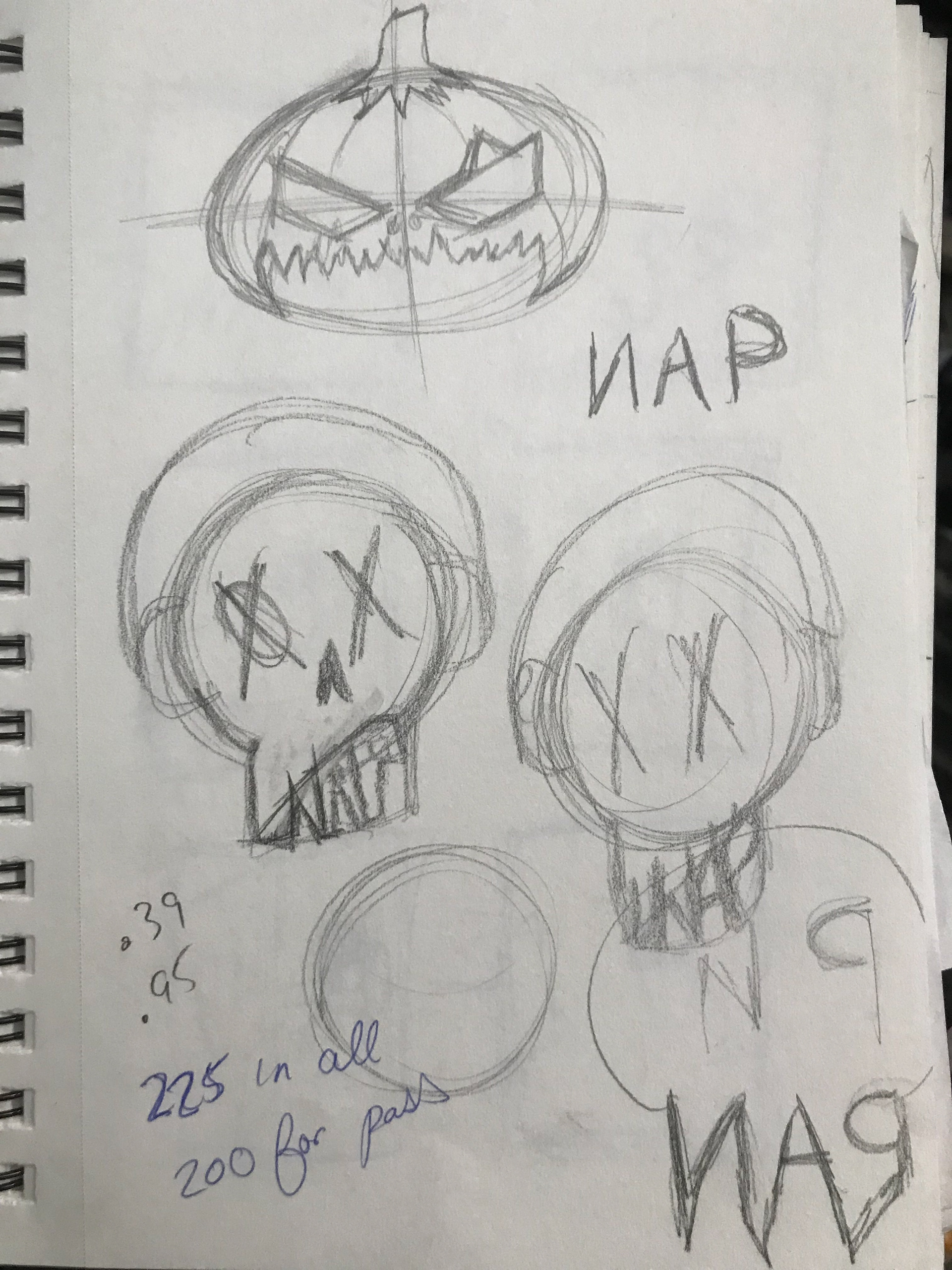
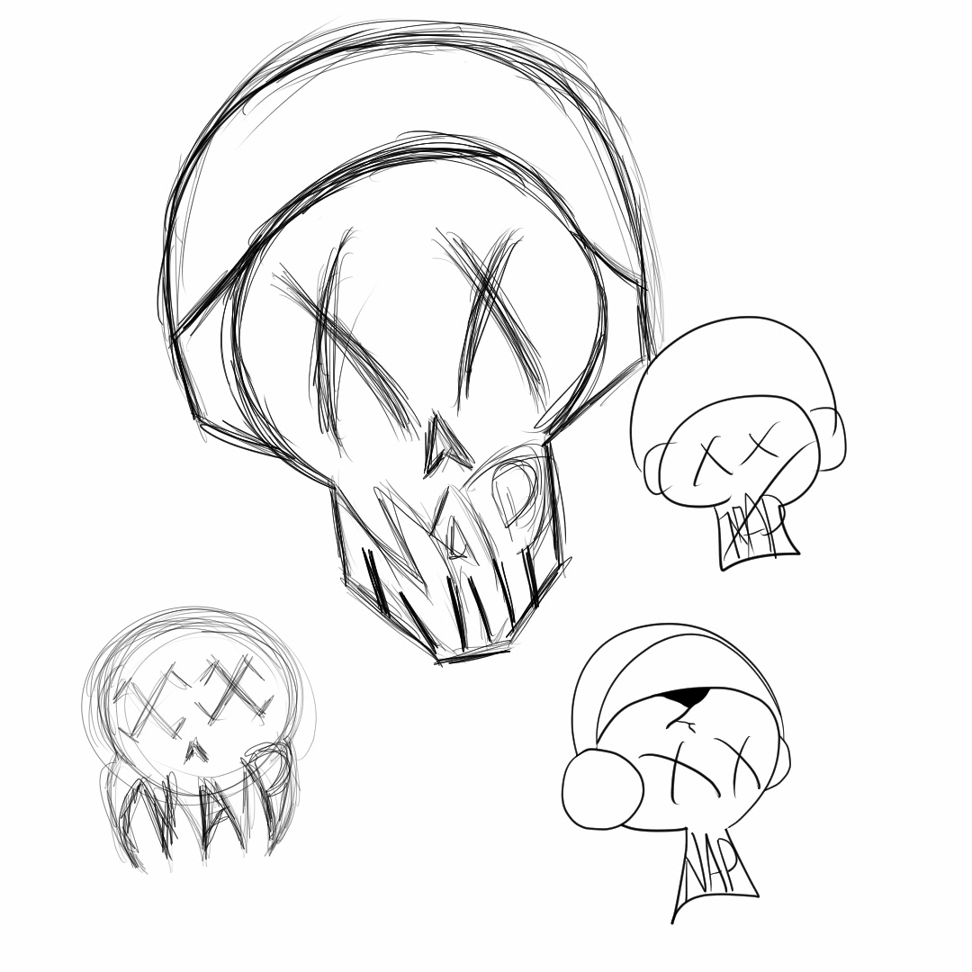
Coming up with the logo was the most fun I had. I knew I wanted a not-intimidating skull. Something that would be cool merch or not overly in your face. I drew out some ideas, and most of them had headphones on to keep the music festival theme. I chose to write "NAP" where the teeth of the skull would be for a cool look. NAP meaning Not A Phase.
Execution
The execution of this project was fun. I was able to add the effects, such as neon outlines, ripped paper, glitched effects, and scratchy textures flawlessly. All of these played so well with each other to set the feel for this festival. In empty spaces, I added shapes like + and - to balance the composition where it might've felt too heavy or too light.
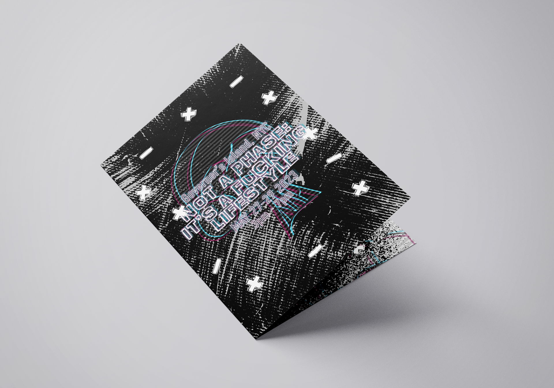
The choice of blue and pink didn't distract from what needed to be read and more so helps guide the viewer's eyes naturally around the page.
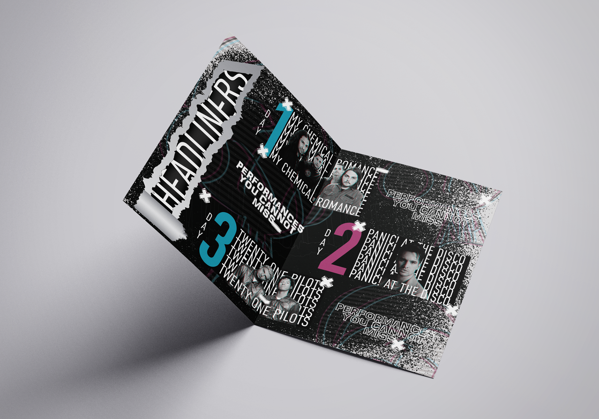
The layout of information was easy to digest so viewers wouldn't have a hard time searching for anything they may need.